
J&B
, NL, Works and lives in Rotterdam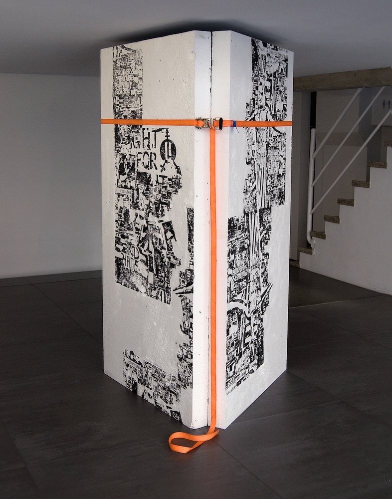
J&B is an artistic collective from Rotterdam, two of whom are Bert Frings and Jacob. Their work has been exhibited in recent years in TENT Rotterdam, TETEM Enschede, Zerp Gallery Rotterdam, Ei! Espai d'ímpulsio Barcelona, Hear Rooms, Galleria Spazioersetti, Udine and Walgenbach Art & Books Rotterdam.
The Rotterdam-based artists, Jacob and Bert Frings, have been working together under the name J&B since the summer of 2015. The work of this artistic duo combines, in their own words, “protest signs with commercial imagery to create still-lives in the Vanitas tradition. Logos, stickers and slogans they have found on the street are re-used on unconventional carriers. These contemporary Vanitas symbols are used to expose the decay, ephemerality and deterioration of a society based on progress”.
Freedom of speech, the refugee problem, but also, for instance, the response of the Dutch newspaper (the Telegraaf) to the deportation of the Turkish Minister of Family Affairs and the subsequent pro-Erdogan demonstrations in front of the Turkish consulate in Rotterdam; these are all examples of topics and events broached by the artists in their work. The link with Arte Povera and Abstract Minimalism is quickly made based on their preference for using simple materials that may even appear worthless. This can easily cause a less perceptive onlooker to suspect that little effort went into creating the works. Nothing could be further from the truth, however, as they are made with the utmost meticulousness and precision. By using disposable goods and consumer goods, the artistic duo challenges the concept of value.
Both of the works of J&B included in the Nora exhibition refer to the problematic situations of people with a non-heterosexual sexual preference or a non-traditional gender identity who are currently living in Russia. The sculpture Doors (2017) suggests that a piece of wall has been placed within the walls of the exhibition, with graffiti-like statements of both supporters and opponents of greater sexual openness and gender-diversity. The triangular shape of the work, which was created from polystyrene, is a direct reference to the symbol used to stigmatize homosexuals in Nazi-Germany. Screen prints have been applied to the work – which is both two-dimensional and three-dimensional – that reflect the different responses to the anti-LHTBQI demonstrations. The work not only allows place for both positive and negative statements, but also seems to provide a solution for the conflict.
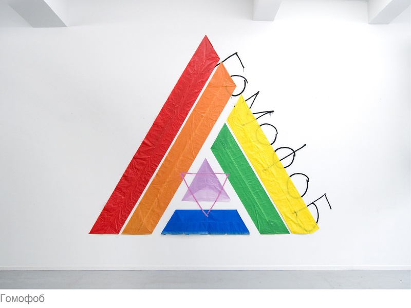
The mural Homofoob, which is largely made from refuse bags, is also triangular-shaped and – because of the pink triangle incorporated within it – refers even more directly to the persecution of homosexuals during the second world war. The use of colour is a reference to the rainbow flag used by the LGBTQI community. By specifically using the colours of the first rainbow flag, the work can also be interpreted as a call for a greater sense of community within the LGBTQI community. Instead of focussing on what binds them, each group currently seems to be fighting mainly for its own place. This is apparent from the increasingly longer acronym that forms the community’s name and by the growing number of individual flags. This is understandable, in view of the fact that each community has its own specific problems, but at the same time it also seems to be at the expense of the cohesion that is still so necessary between the various parts of the LGBTQI community.